Poster Fold Design
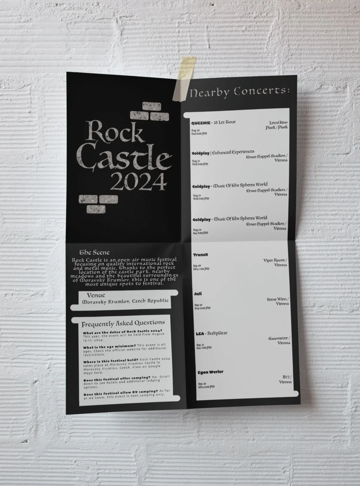
Original Design
The Poster Fold Design project aimed to create a design which utilized typographic manipulation and hierarchy in order to visually express the essence of a particular music festival. For this project I chose the ‘Rock Castle’ festival, a European heavy metal concert which takes place in a medieval castle. Most of my early designs for this project involved the juxtaposition of the two main elements, Rock and Castle. These visual elements did not work well together to create a coherent aesthetic, so I focused on the Castle aspect. Next the challenge was creating a hierarchy which communicated the information to the reader. At this point my design relied too heavily on the non-typographic brick pattern which covered much of the poster, so for my final iteration I re-designed the poster to rely less heavily on the brick wall pattern and more on the typography.
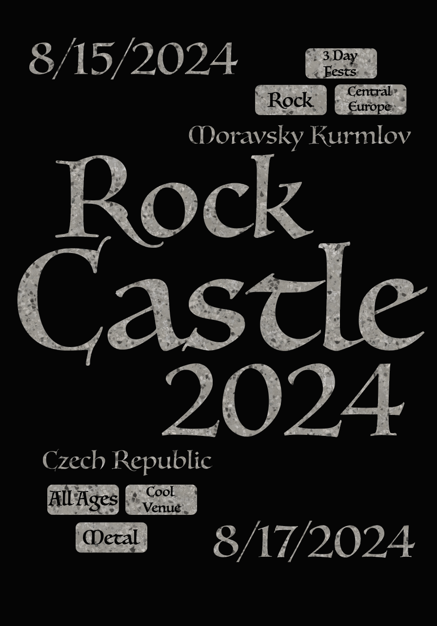
Updated Design
The Process
Initially the ‘Rock’ and ‘Castle’ elements were both included and put alongside each other.
At this point, the logo was still attempting to juxtapose both conceptual elements
I was deciding on the typefaces and how the hierarchy would be established
In this more finished design, I placed the nearby concerts in individual boxes meant to look like scrolls, with staggered orientation
The bottom part of the front was relying too heavily on the brick wall pattern, which is not a typographic manipulation
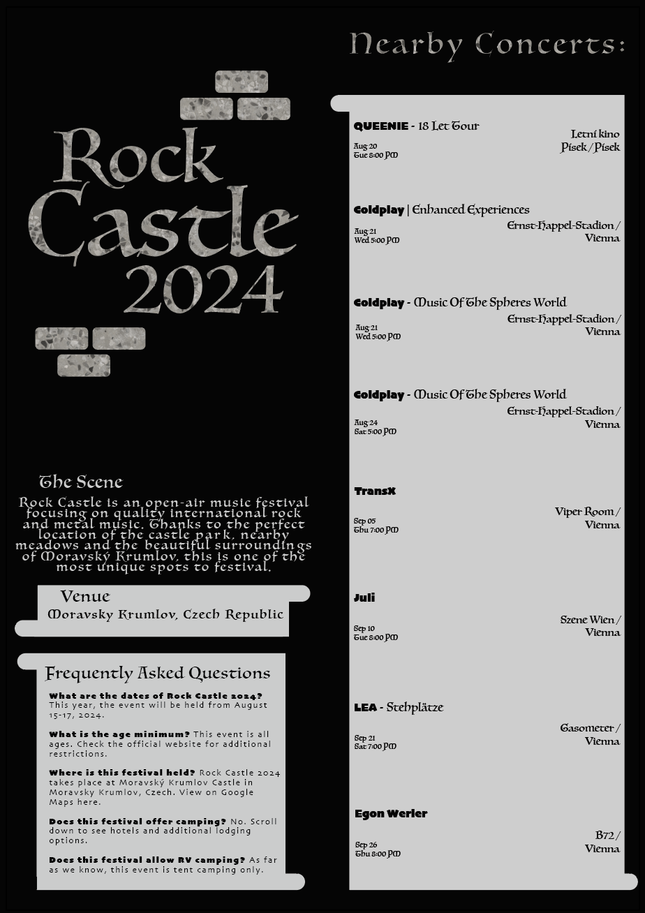
The overuse of the brick was solved with this updated version, the brick is still present, but much diminished and only as a vehicle for the tag type.
The individual and staggered scroll box was stretched out into one consistent scroll.


